SAS GUI Redesign
Overview
Background
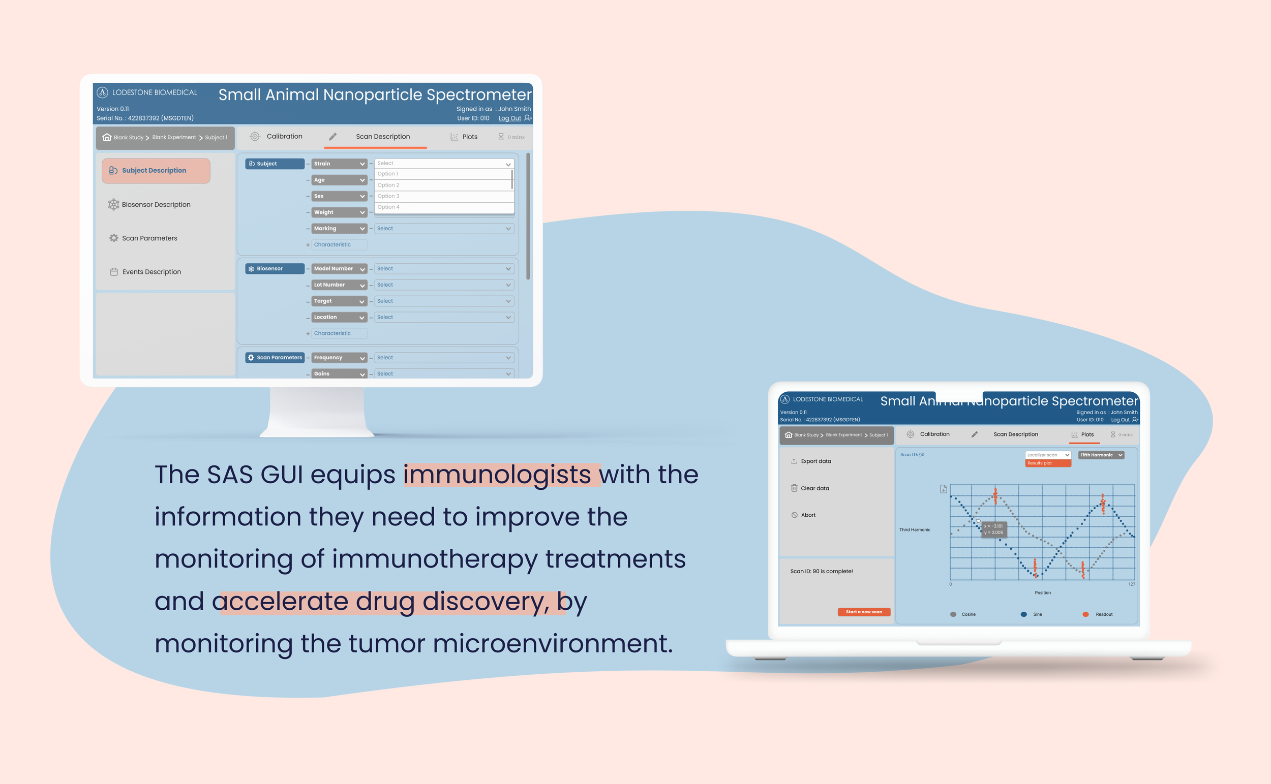
Lodestone is a startup that is developing a groundbreaking nanoparticle technology to improve monitoring of immunotherapy treatments and accelerate drug discovery. They developed a readout system to detect and quantify a pathogenic protein with minimal invasiveness. They are now looking to redesign their UI to better support immunology researchers throughout the process.
My role
UI/UX Designer in a team of 1 designer and 1 developer
Challenge
Redesign Lodestone’s user interface to be an intuitive and functional GUI that guides the user through the necessary steps of the process without error; Restructure UI information and content.
Scope
January - June 2023
Internship and design project for Masters of Engineering

Overview
Lodestone developed the technology to implant biosensor probes, which contain nanoparticles, into tumor tissue. The tissue is inserted into a spectrometer called the Small Animal Scanner (SAS). The nanoparticles in the probes bind to molecules in the tissue and the readout obtained from the tissue using the SAS gives immediate treatment response indication. The SAS, thus, will show to our user scientist whether a drug is treating a tumor or failing to do so.
Lodestone has also developed a software for the SAS to help users interface with the hardware. Users use the SAS GUI to calibrate the small animal scanner and to view the readout from the probes that are implanted in tissue. Lodestone is using mice for their experiments currently, but they are planning on expanding the experiments to include human tissue at later stages.
Our Partners
As part of our course, Cook Engineering Design Center (CEDC) connects students with industry partners to solve real-world problems. Our sponsor, Lodestone Biomedical, is a biotechnology company whose mission is to enable immediate detection of treatment response in support of precision medicine across cancer therapies and emerging immunotherapies. The company’s technology provides non-invasive, longitudinal, real-time monitoring in the tumor microenvironment, which will accelerate clinical trials and enable true precision medicine as the new standard of care. The technology is used in the Gaur Lab at Dartmouth Hitchcock Medical Center by students of Geisel School of Medicine.


Process
Key Features:
Login page that allows users to create accounts or login into existing accounts.
Study, experiment, and subject pages to create, edit and export studies, experiments, and subjects respectively.
Calibration page that fine tunes the SAS hardware to reduce errors by ensuring that measurements provide accurate results.
Scan description page to define a scan, by providing information about the subject, the biosensor, the scan parameters, and the timeline of data collection.
Plot page that provides users with interactive and customizable graphs that are of interest to them.

Feedback:
Default values: “Most non-expert users would not know which values to use for calibration, if not specified by their PI”. Having the option of using default values reduces the chance of error and ensures quality assurance.
Quick scans: “Sometimes I just want to do a test run”. Although having a structured hierarchy when conducting studies is very helpful to keep the users organized, it is a very long process if the user is interested in running a quick scan.
Order of steps: “You cannot calibrate the hardware without the info I put [in the description page]”. Switching the order of two pages was needed.
Landing Page
Original
Poor visual hierarchy
UI is dull and un-inviting
Cannot create accounts
Easy to miss call-to-action (CTA) buttons
Blanks need to be filled are not exhaustive
Poor visual consistency
Very tedious; need to fill blanks per scan
Results visualization Page
Redundant elements: table
One graph per scan
Export Data Page
Experiment Page
Revised

Improved visual hierarchy
Users can create new accounts or login to existing ones.
Clear CTA buttons
Easy to miss button
Poor visual balance
Blanks are exhaustive
Great visual consistency
Only need to fill blanks once per experiment =~ 20 scans
Interactive and customizable graphs
Two graphs per scan : current scan and longitudinal experiment scan
Linear workflow; cannot miss steps
Better visual balance
Additional Deliverables


Impact
Launch
Lodestone employed the services of Ryan Orendorff, who was consulted throughout the two terms, to develop the GUI using PySide6 UI framework. The SAS currently runs on the improved design of the GUI. It is currently being used by labs in DHMC and Yale university to run mouse experiments for a cohort of 100 mice to validate a biosensor in a preclinical glioma model during treatment with bevacizumab.
Outcome
With the identification of the 6 new features, there has been a 65% increase in user’s satisfaction with our newly implemented system, a 45% decrease in user support requests, a 50% decrease in development time and an increase in market competitiveness.
Reflection
Being a junior designer in a startup entailed taking on different roles. I found myself creating and executing a full research plan, designing and testing a solution, as well as identifying successful financial strategies and how they can be integrated into Lodestone. I was in charge of a project that I pitched myself, took the initiative to envision and then pushed for its implementation. As the sole designer for this project, I had to independently plan out and follow through with the design process while also educating others about what it entails.
Using my engineering education to best create efficient and effective design solutions. The largest struggle of this project how complicated the technology and the data collection process was. Understanding the workflow and the engineering behind the product was critical to better support our users, advocate for my work, and communicate its importance to the stakeholders. My well-rounded engineering education allowed me to create a user-friendly medical interface that was feasible considering the constraints of development. Good design looks pretty but great design is utilitarian. It is about problem solving!

Walking in a scientist’s shoes
To better learn about my user demographics for whom I am designing, I conducted interviews with 7 current users of the interface to better understand the shortcomings of the current design and to identify their needs and wants. I also developed an empathy map which helped me identify what our users are struggling with and where in the process this is occurring.
Who is our user?
I combined my user research with data on existing biomedical technologies in order to create a persona representative of the target market.

Click to view full persona cardAfter identifying our user persona and conducting user interviews, the following research insights became evident:
INSIGHT 1:
Multiple Interfaces
The old GUI required the user to interact with Reaper, a digital audio workstation software, to calibrates the SAS before taking measurements of a sample.
This entailed editing complex settings that a non-expert user would be incapable of navigating. Eliminating the need for multiple interfaces was a priority for the new design.
SPECIFICATION 1:
Our solution must...
Automatically calibrate the SAS, so that our user only interacts with the SAS GUI. This would streamline the process, save time, eliminate unnecessary complexities, and reduce the number of required interfaces by one.
“I do not understand much of the engineering that happens in the background and I frankly do not need to. I am only interested in the visual results I get at the end.”
- Arti, Immunologist

INSIGHT 2:
Need for interface guidance
The data collection process is very complex and intricate; it entails so many steps and interdependencies. The old GUI does not walk the user through the process at all. It is not intuitive for a non-expert user; it is made up of one page that contains several buttons, with no guidance on what to press and when.
SPECIFICATION 2:
Our solution must...
Guide the user through the necessary steps, and prompt them to do sanity checks often to ensure proper operation of the machine and quality assurance of the measurements made.
“We cannot accommodate all of the customer service requests. It is very overwhelming, especially when most of the requests are about the sequence of button clicks. The company is small, so the response time is often not ideal.”
- Christian, Lodestone COO

INSIGHT 3:
Need for interface confirmation
The previous GUI asked for user’s confirmation when prompted to carry out actions that affect the acquired data, such as aborting data collection and clearing the measurements made.
SPECIFICATION 3:
Our solution must...
Maintain this added layer of protection, as data acquired is very valuable to the user and continues to be our priority. Quality data will ensure a clinical trial is successful, resulting in better and faster patient treatment.
“The data that the SAS gives us is incredibly valuable for my research and the field as a whole. Being able to tell if a drug is working or not early on will improve the process of treatment and save time for cancer patients who desperately need it.“
- Carmen, Biologist

INSIGHT 4:
Login page
The old GUI has no Login Page, which creates issues when files get accidently deleted or edited. Since we knew that the SAS would be used by multiple users/labs within the facility, it was determined that accounts would be necessary.
SPECIFICATION 4:
Our solution must...
Allow the creation of accounts, so that different people/labs can use it within the facility. Accounts provide an easy way of keeping track of who the users are and when their ideal time of operation is.
“It is definitely safer to have accounts, especially as the SAS gets employed in bigger labs and research facilities. We would need to know who is accessing each team’s data and results.“
- Lisa, Biomedical Engineer

Click to view insights from user interviews
Click to view the empathy mapAfter conducting the interviews using the current design of the interface, several pain points became evident:
1. Inaccessibility to non-expert users
The process of data collection using the SAS technology is very complicated and intricate. There’s a lot to learn about the system and the learning curve is steep.
2. Tool guidance
Because there are so many steps to working the SAS and navigating the interface, tool guidance through the entire process is very critical.
3. Streamlining the process
The old design requires that users interact with the SAS GUI as well as an audio workstation software. Removing the need for users to use a second software is critical for simplifying the workflow.
INSIGHT 5:
Structure of hierarchy
The old GUI showed no hierarchy whatsoever; it had a flat structure. The user would input the data for a single experiment before proceeding to take measurement of the sample. After talking to users, it became evident that a hierarchy is necessary to streamline and speed up the process.
SPECIFICATION 5:
Our solution must...
Have a structure of hierarchy. Each user/lab would have an account, where studies can be created. Each study would contain multiple experiments, and each experiment would have multiple scans. In terms of mouse experiments, each mouse would have its own experiment. Users would run 10-30 scans per mouse.
New structure of hierarchy“It’s tedious to write down the same info over and over again, especially since we’re giving each mouse the treatment at least 15 times/study.“
- Gabby, Researcher

Hierarchy diagramA glimpse into our prototyping
I approached our prototyping process with the intention of constantly iterating and seeking feedback from DHMC researchers, Geisel students, Lodestone employees, and the Thayer Community. Our research indicated a prominent need for redesigning the GUI to provide an intuitive experience for our users.
I created prototype plans to help facilitate this process. As I prototyped our solutions, I allowed our users to navigate throughout the GUI. As they explored the interface, I asked them to self-narrate any thoughts.
Information Architecture
To better understand the workflow of the current system and interface, I created a flowchart of the entire process as well as one of the current UI. This helped me identify steps that I can combine or get rid of and ways to create the ideal user path. In order to understand the ideal user path, I built a task flow of the data collection process from start to finish.
Click to view SAS GUI Workflow 
Click to view SAS (hardware & software) Workflow
Click to view task flow of the UIWireframe Sketches
I came up with a few early sketches for the interface in order to determine which components worked best together. I then adapted elements from my earlier sketches to create wireframes for key pages on desktop.


Click to view what our users had to say


Prototyping and Feedback
Following our industry and user research, flow sketches and grayscale wireframes, I developed low-fidelity prototypes to explore different layouts for the pages. In the iterations, I worked in Figma to craft various low-fidelity prototypes and high-fidelity prototypes.
Color
I started brainstorming appropriate color palettes for the interface. I created different color iterations and ultimately ended up choosing the last version. I chose blue and orange as my primary and secondary colors respectively, as blue provides a “clean and calm” interface – exactly what is needed while navigating through Lodestone’s medical interface. Orange, on the other hand, brings attention to key features and is a nod to the company’s name which means mineral magnetite.
After exploring different styles, I created a few provisional UI components in accordance with atomic design principles.


Different iterations of the color scheme


Usability testing
To evaluate the efficacy of the interface, I conducted usability tests on 5 users. I received a range of feedback pertaining the design, the hierarchy of information, the call-to-action buttons, the results visualization, and the impact our product can have on cancer research.
When gaining feedback, I always yearn for people to be as honest as possible because it makes our role as designers more clear.

Final version of the color scheme

Solution
After conducting a range of user testing, it was clear that the SAS GUI needed to reduce the complexity of navigating the entire process. As a result, I designed our final iteration of the UI to highlight the UI’s flexibility. We wanted our users to know that they are supported whether they are interested in conducting an entire study or a quick scan.
After ensuring that the design was intuitive to researchers, we presented our tool to the CEO of Lodestone Biomedical, Solomon Diamond, and the COO, Christian Knopke and received wonderful feedback.
Design decision breakdown
Estimation of scan time
Time is very critical when running experiments, especially mouse experiments. A mouse can be kept under anesthesia for a certain amount of time. If an experiment takes longer than the allotted time, the user is risking killing the mouse. Our users were very excited by the potential to estimate the length of the scan. Having an indicator that shows the user how long an experiment is expected to take is very important to ensure data quality and proper care for tissue (both mouse and human).
Intuitive interface and linear workflow
The previous interface was not intuitive. How is the user supposed to just know which button to press, especially when some of them were so easy to miss? I changed the workflow of the GUI so that it is linear. Our users do not need to wonder what the sequence of steps are, the UI just takes them were they need to be after performing a task. The new GUI also allows both quick scans and long studies.
Results visualization
I created a simple, clean visualization page that allows users to investigate the effect of a drug on the tumor microenvironment based on the current scan and the previous scans within an experiment.

GUI Comparisons
Click to view screens in a pop-up


